 Love music trivia? 🎵 Try Weekly Spin, our daily social music discovery diary!
From Protection to Art: A Brief History of Album Covers
Before 1938, records were sold in plain brown paper sleeves. They were purely functional, designed only to prevent the fragile shellac discs from scratching. Today, album art is a vital part of music culture. How did we get here? The transition from utility to art is a fascinating journey that mirrors the history of graphic design, printing technology, and the music business itself. In the early days of the recording industry, the physical medium was treated as a delicate mechanical object, and packaging was minimal and sterile. However, as music became a primary form of mass entertainment, the industry began to realize that the visual presentation of a record could play a major role in its commercial success. This led to a creative revolution where album covers became a key canvas for visual artists, designers, and photographers. The album cover evolved from a protective sleeve into a key component of a musician's artistic statement, transforming the physical record into a comprehensive sensory package that combined sound, design, and identity. Understanding this evolution helps us appreciate how visual culture and music have been deeply intertwined for nearly a century.
The Pioneer: Alex Steinweiss
The transformation began with Alex Steinweiss, a young art director at Columbia Records. In 1938, he convinced his bosses to let him design a poster-like cover for a collection of Beethoven symphonies. The result was immediate: sales for that record skyrocketed by 800%. The "album cover" was born. Steinweiss realized that the record cover could be used to convey the mood and character of the music inside. He designed covers that used bold typography, vibrant colors, and striking illustrations to capture the listener's attention. This innovative approach transformed the retail environment of record stores, turning dull racks of brown paper into colorful, inviting galleries of art. Steinweiss's success established a new standard for the music industry, and other record companies quickly followed suit, hiring their own art directors and designers to create eye-catching covers. The introduction of the album cover also shifted packaging economics, as record companies realized that investing in high-quality cover art could yield massive returns in sales. This marked the birth of a new industry of music packaging and graphic design, setting the stage for the iconic album covers of the decades to come.
The Golden Era of Vinyl (1960s-1970s)
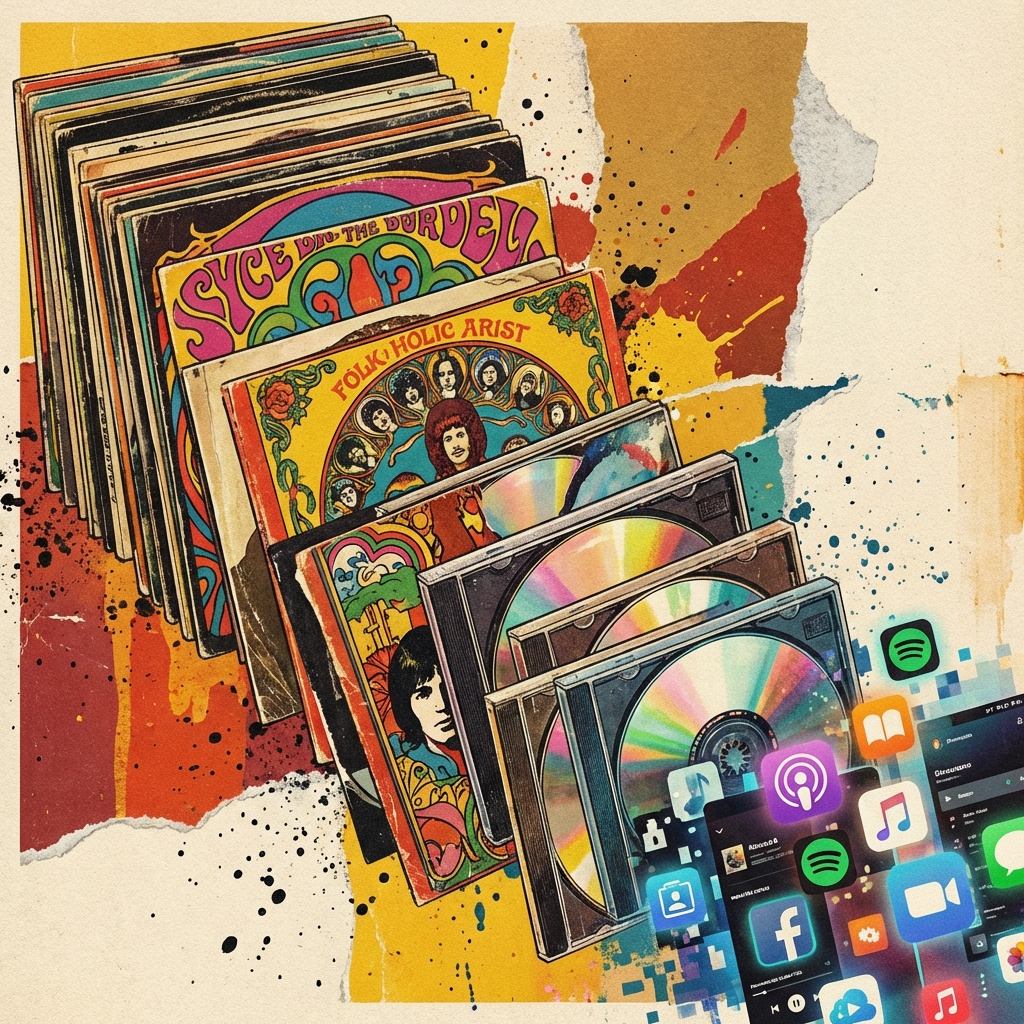
The 12-inch LP canvas allowed for incredible artistic expression. This era gave us the most iconic visuals in music history. The rise of the 12-inch long-playing (LP) record in the late 1940s and 1950s provided designers with a massive 12-by-12-inch canvas to work with. This larger size allowed for much more detailed and ambitious designs, including gatefold sleeves, booklets, and custom inserts. The LP design became a central part of the listening experience. In the 1960s and 1970s, as the album format became the dominant artistic medium for musicians, album cover art reached new heights of creativity. Bands began to work closely with visual artists to create covers that were direct extensions of the music itself. The packaging became a physical representation of the music's themes and concepts. Designers experimented with different materials, printing techniques, and structures, turning albums into collectible art objects. The experience of buying a record, bringing it home, and examining the cover art while listening to the music became a sacred ritual for millions of fans around the world, cementing the album cover's place in popular culture.
- The Beatles - Sgt. Pepper (1967): Pop art meets collage, signaling that music was high art. Designed by Peter Blake and Jann Haworth, this cover features a colorful collage of historical figures, celebrities, and symbols, reflecting the psychedelic culture and artistic ambition of the late 1960s. The packaging also included a gatefold sleeve, lyrics printed on the back, and a sheet of cut-out inserts, setting a new standard for album presentation and elevating the medium to a form of fine art.
- Pink Floyd - Dark Side of the Moon (1973): The simple prism design that became a global symbol. Created by the design group Hipgnosis, this iconic cover features a simple, clean prism refracting a beam of light into a spectrum. The design represents the band's stage lighting, the album's themes of conflict and madness, and the request for a clean, elegant design. The packaging featured custom posters and stickers, illustrating the potential of album art to create a lasting brand identity.
- The Velvet Underground & Nico (1967): Andy Warhol's peelable banana. This legendary cover features a simple yellow banana designed by pop artist Andy Warhol, with the instruction "Peel slowly and see" written near the stem. Early copies of the album allowed listeners to peel off the yellow banana skin to reveal a pink, flesh-colored banana underneath. This interactive and provocative design challenged traditional notions of album art, bridging the gap between music, visual art, and commerce.
Visual Identity
In this era, the cover didn't just contain the music; it explained it. You could judge a record by its cover because the aesthetic was part of the band's identity. The visual identity of a musical act was defined and communicated through their album covers, creating a cohesive brand that fans could instantly recognize and connect with. The collaboration between musicians and designers during the golden age of vinyl produced a rich visual language that transcended the music itself. For example, the dark, surrealist designs of Storm Thorgerson for Pink Floyd, or the sleek, futuristic aesthetics of Kraftwerk, became synonymous with their musical style. This tight integration of sound and vision meant that an album cover was not just a promotional tool but an essential element of the artistic statement. The visual themes explored on the cover would often extend to stage designs, promotional materials, and merchandise, creating a unified artistic universe. This powerful combination of music and design helped define the cultural identity of entire generations, leaving a lasting legacy in the history of art and design.
The CD Era and Photography (1980s-1990s)
As formats shrank to the compact disc (CD), the canvas got smaller. Intricate paintings gave way to bold, striking photography. Portraits became dominant. Think of Bruce Springsteen's denim backside on Born in the U.S.A. or Nirvana's underwater baby on Nevermind. The goal was to rely on images that were instantly recognizable even at a smaller size. The shift from vinyl to CD in the 1980s presented a significant challenge for designers. The 5-inch plastic jewel case offered less than a quarter of the surface area of a 12-inch LP. The intricate details, textures, and subtle nuances that worked so well on a vinyl sleeve were lost at this smaller scale. Consequently, the industry adapted by shifting its focus toward bold, high-contrast photography and simple, punchy graphics. Portrait photography became particularly dominant, as close-up images of artists' faces or striking, single-subject photos could still convey strong emotions and catch a buyer's eye in a retail environment. The CD era also led to changes in packaging economics, with the introduction of multi-page booklets and insert designs that allowed for lyrics, additional photos, and liner notes, offseting the loss of the large outer cover.
The Digital Age and Thumbnail Art
Today, most people see album art as a tiny square on a Spotify playlist or an Apple Music notification. Designers now prioritize simplicity and high contrast. The art needs to look good whether it's projected on a massive stage or displayed as a 50-pixel icon on a smartwatch. The digital streaming era has introduced new thumbnail scaling issues, forcing a complete rethinking of album design. An image that looks stunning on a large computer screen can become an unreadable, cluttered mess when scaled down to a small thumbnail on a mobile device. To combat this, modern designers often use clean typography, simple color palettes, and bold central images that retain their clarity and impact at any size. The digital format has also stripped away the tactile elements of album packaging, such as the feel of the cardboard, the scent of the print, and the experience of reading liner notes. However, this has also opened up new digital possibilities, such as animated album covers on streaming platforms, interactive web experiences, and digital booklets, showing that while the format changes, the need for visual expression remains constant.
Why It Still Matters
Despite the shift to streaming, the "visual album" is making a comeback. Vinyl sales are at a 30-year high. People still want that tangible connection to the music. The cover art remains the face of the music, the first thing you see before you hear a single note. The physical vinyl resurgence is a testament to the enduring power of physical packaging. Music fans are increasingly seeking out vinyl records not just for the warm, analog sound, but for the tangible, large-scale artwork that accompanies them. Holding a 12-inch record sleeve, reading the gatefold notes, and admiring the artwork is a sensory experience that digital streaming simply cannot replicate. This resurgence has revitalized the field of album cover design, encouraging artists to create elaborate, high-quality physical packages once again. It demonstrates that the relationship between music and design is not a relic of the past, but a living, evolving art form. The album cover continues to be a crucial gateway to the music, providing a visual context that shapes how we perceive, remember, and connect with the sound.